How would you feel if a business colleague appeared unkempt for your first virtual meeting?
It’d probably be a turn-off for you and a thumbs-down for the other person.
This same thing applies to your homepage design. Your website’s homepage is the landing page — the first place your guest lands on when they find your domain.
In that sense, how you design your website can determine whether visitors stay on it and browse other pages. If a website looks poorly made, users will likely doubt its reputation and move on quickly.
However, retaining visitors isn't an easy task when most users spend less than 15 seconds on a website. That's why if you want to make an impact, you need a website homepage that catches visitors’ attention and turns them into revenue-increasing customers.
Website visitors are like interviewers. They are constantly searching for brands or products they can trust to solve their pain points. So, you need to showcase what you've got with an awesome homepage.
Here's what we'll cover:
- What Makes a Great Homepage Design
- The Benefits of a Well-Designed Homepage
- 11 of the Best Website Homepage Design Examples
- Final Thoughts: 11 Homepage Examples for Inspiration in 2024
What Makes a Great Homepage Design
The best homepage examples don’t boast a lot of complexity or technicality. The traits and practices of a good website homepage design are more straightforward than they seem.
So, what makes a good website design for homepages?
A good homepage should have these important elements:
- Customized logo representing your business.
- Navigation bar highlighting the vital pages in your website’s header.
- Hero section displaying pictures or videos in the header.
- Headline on the hero section stating your unique selling proposition (USP).
- Call-to-action (CTA) buttons in multiple strategic places.
- Social proof like authority website banners, testimonials, or customer reviews.
- Text like website copy and content.
- Media files such as photos or videos to keep visitors visually engaged.
- Footer summarizing your web pages using quick links.

Here are some of the characteristics of the best homepage examples. A brilliant homepage...
Is Clear and Specific
Your homepage has to state in simple terms who you are, what you offer, and who your audience is.
You don't have much time to convince your prospects and website visitors, so avoid complex messaging. Using clear, uncomplicated terms to communicate your brand message helps prevent visitors from immediately leaving your website.
Moreover, remember that your ultimate goal is making sales. Therefore, it's a good idea to use captivating CTAs to tell website visitors the actions they should take. Phrases like Buy Now, Learn More, Contact Us, or Free Trial gives visitors direction and leads to conversions.
Speaks to the Target Audience
Create a homepage that attracts your target audience. Avoid using vain words that don't add meaning to your copy and address your target market's challenges.
Keep in mind user search intent helps you create a compelling value proposition. After all, it's hard to attach value to any offer if you don't know where your audience is coming from. The more you know your audience, the better you will be writing a persuasive value proposition they can't resist.
Optimizes for Easy and Multi-Device Usability
Your homepage should be easy to navigate. Moreover, it needs to support multiple browsing interfaces. In other words, your homepage should have a responsive web design.
People have little to no patience for websites that are difficult to load or have messy pop-ups and menu placements. Your homepage should:
- Be mobile-friendly.
- Avoid complex website elements.
- Support scrolling.
Great homepages need great hosting
Officially recommended by WooCommerce, our hosting is made for online businesses like yours
Is Subject to Changes
There is no such thing as a one-and-done homepage. Your homepage should be dynamic and subject to reviews and changes depending on your brand development and website updates.
You can continually upgrade your website and do A/B testing to compare and contrast your homepage designs and content.
Has an Interactive Design
Your website homepage design should be attention-grabbing. Use eye-catching color palettes to create a clean design for your homepage.
In addition, make sure that your chosen color scheme communicates your values. The same applies to background colors and design elements. While doing so, you should also account for use of white space to improve readability.
Keep these and other tips for website design in mind when building your homepage.
Is Easy To Use and Manage
Nexcess Storebuilder is a user-friendly ecommerce website builder that lets you create a homepage or a one-page website that checks these boxes for your WordPress website.
With Nexcess Storebuilder, you can bring your homepage design ideas to life. It empowers you to:
- Create unique homepages that resonate with your audience instead of using starter templates offered by several other platforms.
- Optimize your website homepage for multiple devices.
- Design an attractive website in minutes.
- Customize and update your website easily when necessary.
The Benefits of a Well-Designed Homepage
Creating an awesome website homepage design has various advantages. Here are the benefits of having a well-designed homepage:
Increases Revenue
The more time users spend on a website, the more likely they are to purchase the website's products. And what better way to keep users engaged than offering them a good user experience?
That's where design comes in. Ease of access and presentation help — along with compelling CTAs — visitors find their way to your stock, thus increasing conversion rates and revenue.
That's why good homepage designs play such a significant role in marketing products and services and may even help your website become a top ecommerce site by sales.
Improves Brand Credibility
Without a doubt, design is an essential factor that can determine the credibility of a website.
Think about it — would you trust a messy-looking website's products and services?
Most people bounce off websites if the homepages aren't what they expected, which is more often than not a clutter-free, properly-designed website.
If you do everything you can to grant visitors a smooth user experience, they'll be more likely to trust your brand and consider purchasing your products.
Creates a Good First Impression
Making a great first impression can go a long way in convincing your visitors to buy from you rather than your competitors. Impressed visitors after seeing a brilliant homepage can:
- Become customers.
- Develop a high level of trust for your brand.
- Become repeat buyers.
- Turn into loyal advocates of your brand.
Better Ranking in the SERPs
As we mentioned before, poor website homepage design yields high bounce rates, which affects your position on search engine result pages (SERPS).
Search engines like Google interpret high bounce rates as visitors not being interested in your content, thus lowering your website's SEO ranking. However, the opposite is also true — attractive homepage design helps improve your SEO ranking.
Now that you know the benefits of a great homepage design, let's go over some of the best homepage design ideas in 2024.
11 of the Best Website Homepage Design Examples
1. Evernote.
2. Spotify.
3. Zendesk.
4. Swab the World.
5. Gleamin.
6. Uber.
7. Hootsuite.
8. FreshBooks.
9. Dropbox.
10. Starbucks.
11. Mint.
You might encounter creative blocks with homepage ideas when building your ecommerce website.
While there are several ecommerce and web design trends, here’s our list of the top 11 homepage design examples you can use for inspiration.
1. Evernote
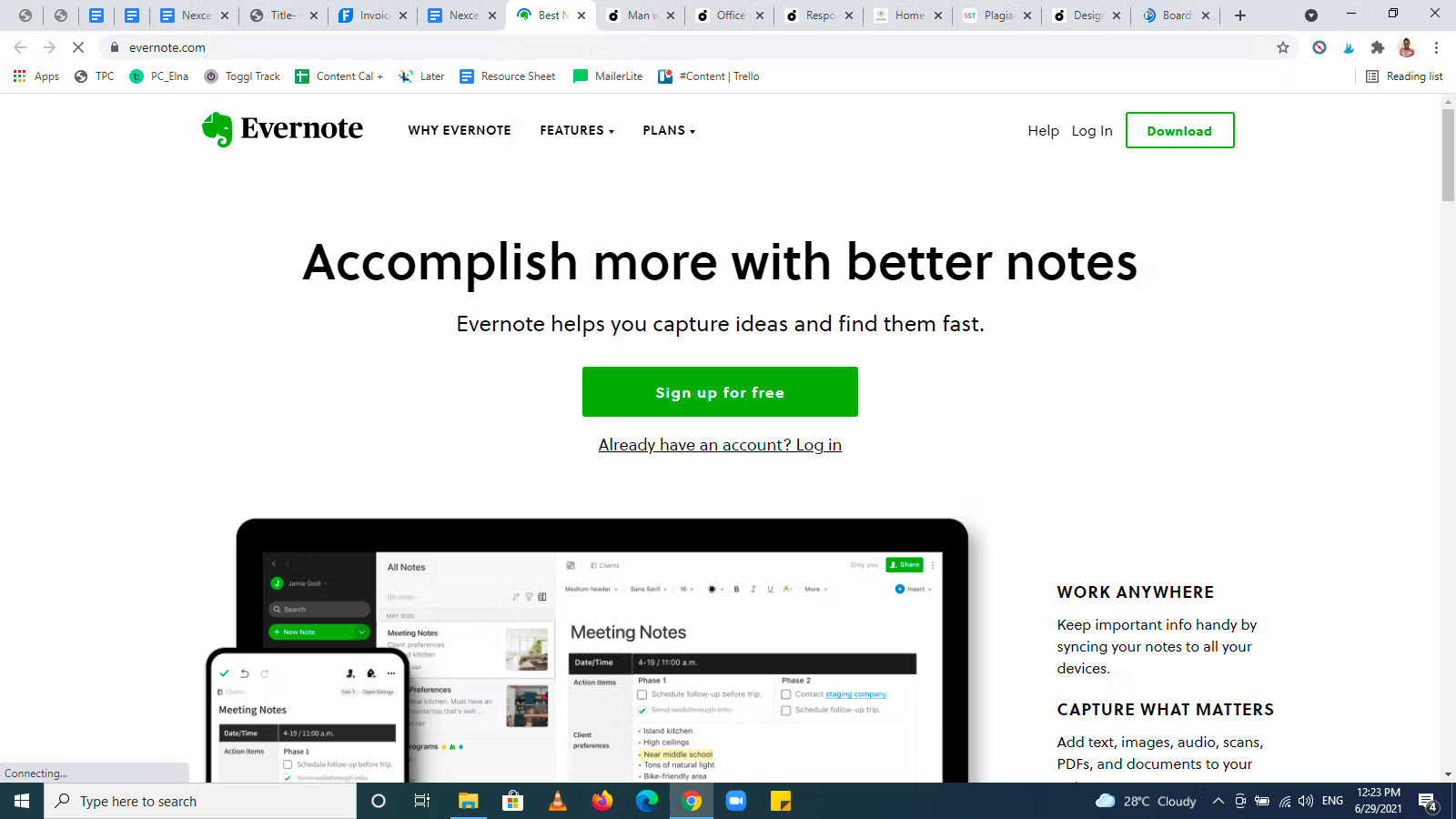
Why Evernote’s homepage example works:
- Evernote’s homepage neatly summarizes what the brand does.
- This homepage includes screenshots of what it’s like inside the app, which enhances transparency.
- The white background with a touch of green makes both text and visuals pronounced and easy to view.
- The primary CTA is highlighted in green — Sign up for free.
Evernote highlights its offers and pricing right on the homepage to save you the stress of searching different packages. Simply select the one you want.
2. Spotify
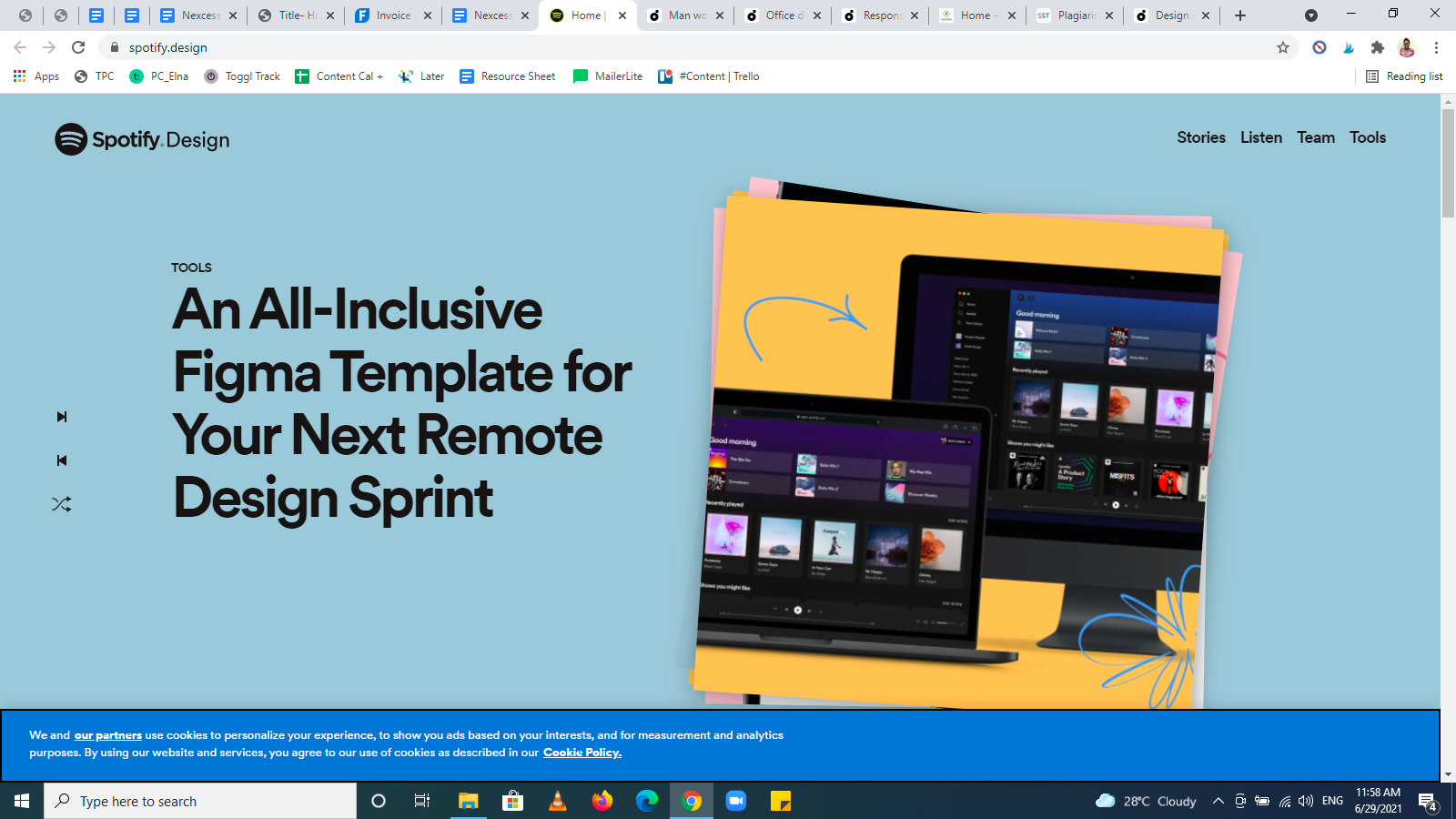
Why Spotify’s homepage example works:
- Spotify’s design reflects the brand's visual and creative mind.
- The bright colors, shadow effects, changing visuals, and animation give the website a solid brand image.
- The colorful sections are separated by white spaces that make the homepage scannable.
- The font and simplicity of Spotify’s design make it an outstanding homepage example.
3. Zendesk
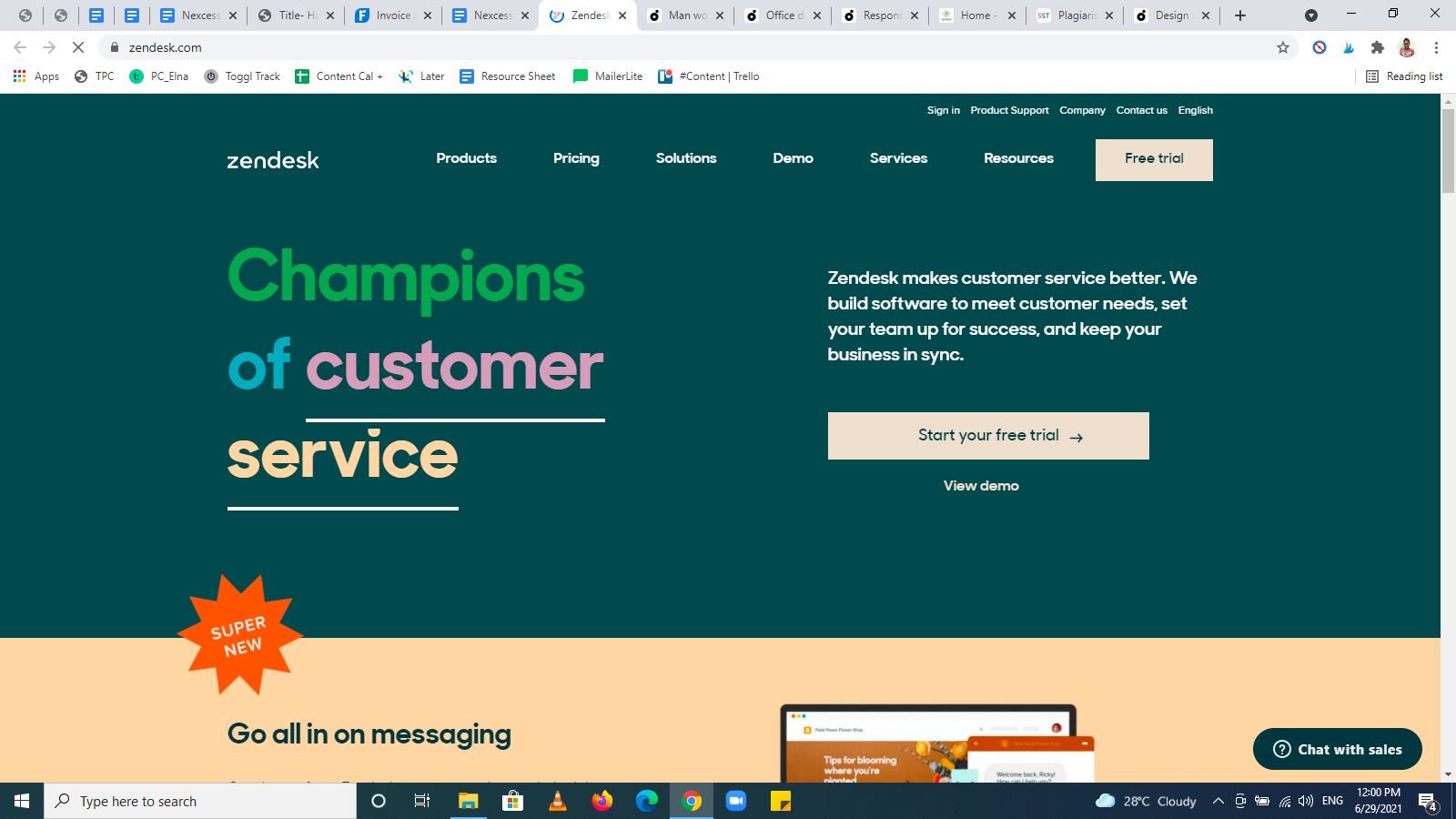
Why Zendesk’s homepage example works:
- Zendesk’s homepage is simple and straight to the point.
- The menu bar is neat and catchy, with well-spaced white text.
- The moment a visitor lands on the homepage, they know what to do. The CTAs are clear and specific — Start your free trial and View demo.
- Zendesk states its USP in the form of social proof — Champions of customer service.
- The website layout is easy to navigate with a large span of white spaces throughout it.
4. Swab the World
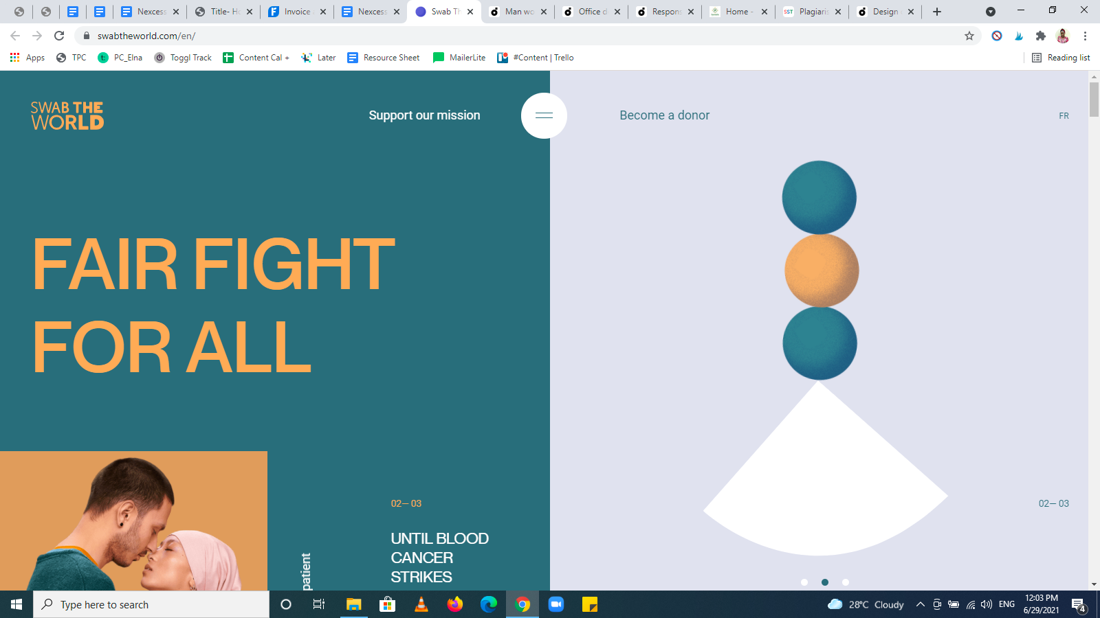
Why Swab the World’s homepage example works:
- Swab the World’s homepage design is both unique and beautiful.
- It has different segments arranged elegantly in different, constantly changing bright colors.
- Its design makes it easy to know what action to take. Moreover, Swab the World repeats the CTA strategically in multiple places throughout the homepage.
5. Gleamin
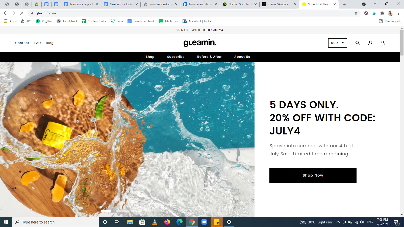
Why Gleamin’s homepage example works:
- Gleamin’s homepage has high-quality photos that attract its target audience.
- It has an uncomplicated menu bar and CTA button — Shop Now.
- The homepage copy explains what the company does concisely.
- The homepage has white spaces and well-sectioned categories.
6. Uber
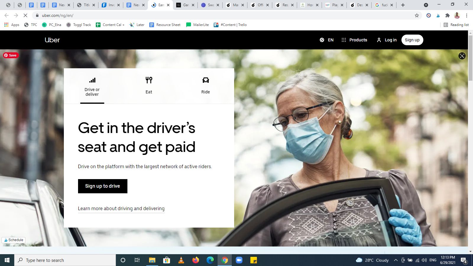
Why Uber’s homepage example works:
- Uber’s USP sits in the white box at the left corner of the hero section.
- The hero section has specific CTAs — a primary CTA (Sign up to drive) and a secondary CTA (Learn more about driving and delivering).
- The images on the homepage align with the brand message.
- The abundance of white spaces on the website helps ease scrolling and boost conversions.
7. Hootsuite

Why Hootsuite’s homepage example works:
- Hootsuite’s homepage design has unique illustrations that make it eye-catching.
- It explains its USP in what seems like a tagline — Social is your superpower — and the line beneath it.
- Hootsuite’s homepage has well-organized sections with nice fonts and neat screenshot-like images.
It has clear CTAs in the hero section. A primary CTA (Start Your Free 30-Day Trial) and a secondary CTA (Compare Plans).
8. FreshBooks
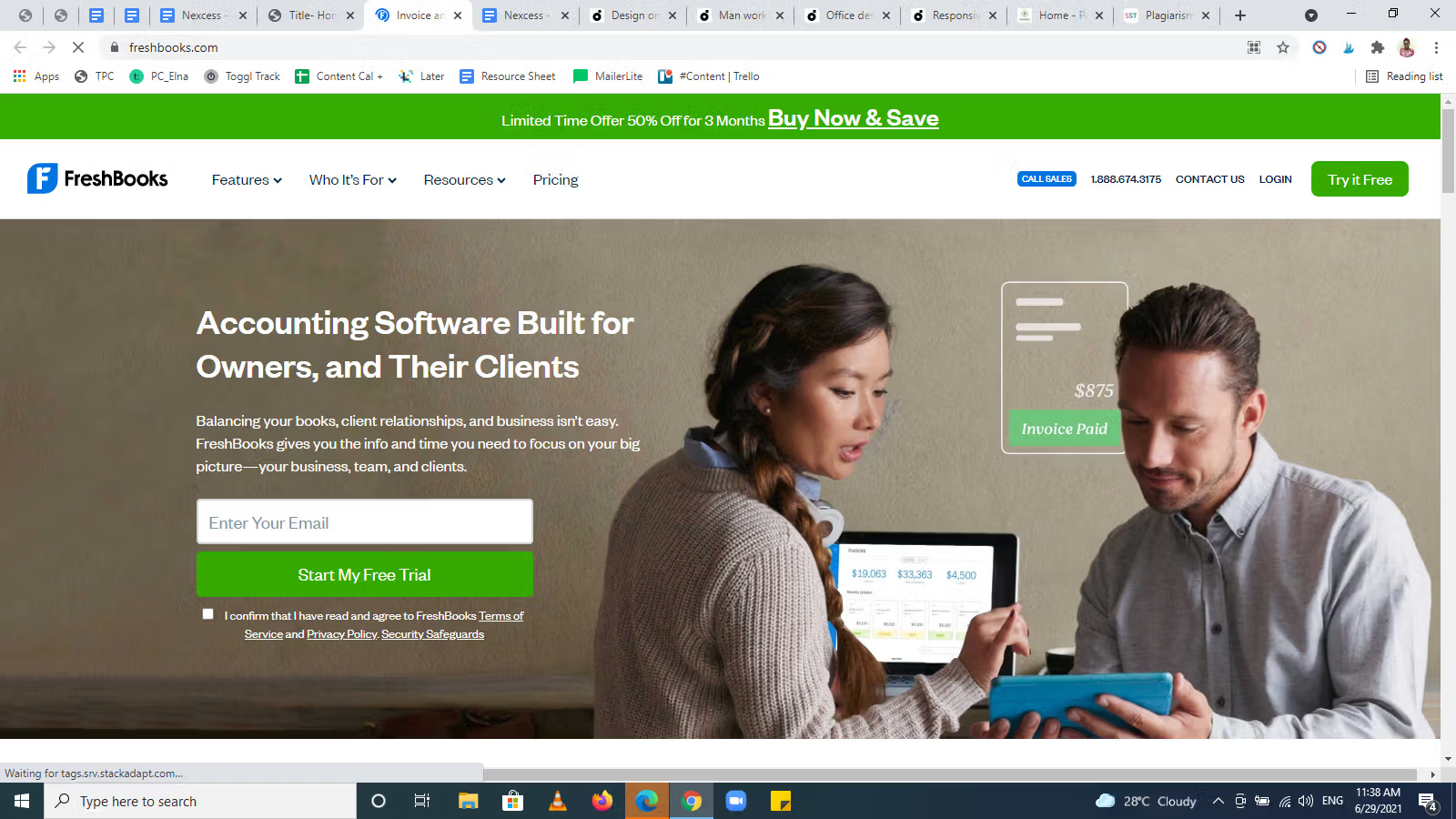
Why FreshBooks’ homepage example works:
- It has a clear CTA button — Buy Now & Save — in the hero section in bold color.
- From the moment you click on this website, you know what to do. The menu options are evident at the top.
- It has enough white spaces between sections spread throughout the homepage.
- Right after the customer review, this homepage example shows off a compelling CTA — Try it Free.
- The website layout makes navigation very easy.
9. Dropbox
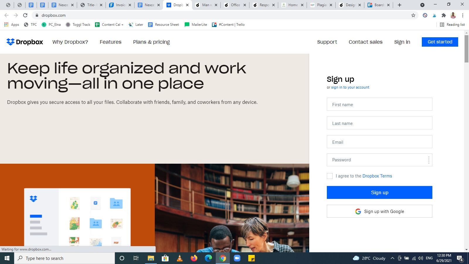
Why Dropbox’s homepage example works:
- Like its tagline, Dropbox has an organized and straightforward homepage design, displaying what’s relevant to visitors.
- Dropbox's homepage has visible menu buttons, as shown in the image above.
- It also opens up a signup form which is the primary CTA on the homepage.
- Its functions are simplified in a compressed widget. To know more about each function, you need to expand it.
- Its footer is well arranged and makes it easy to find what you’re looking for.
10. Starbucks
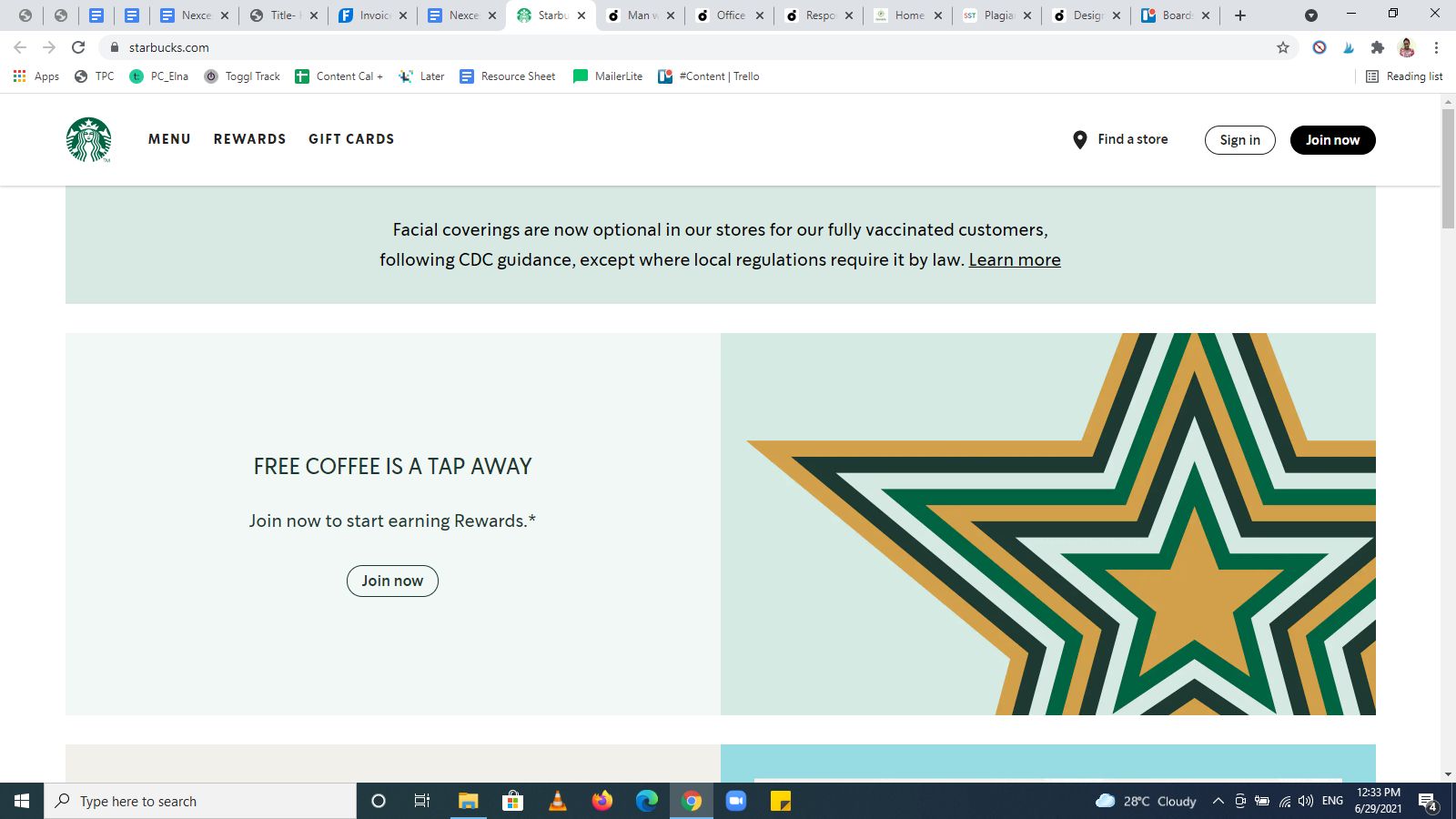
Why Starbucks’ homepage example works:
- Starbucks’ headline compels you to take necessary action to get free coffee in a single click.
- Its CTA — Join now — is clear and easy to locate.
- Starbucks' website homepage design is simple and straight to the point.
- The sectioned areas contain attractive images and text that is easy to read.
11. Mint

Why Mint’s homepage example works:
- It’s a simple design with a solid and concise headline and sub-headline.
- The homepage gives off a secure yet friendly vibe. That is necessary for Mint’s audience to trust it with their financial information.
- The video of the happy person in the hero section is a reassuring element that makes it credible.
- Mint’s homepage has a clear CTA button — Sign up free.
Final Thoughts: 11 Homepage Examples for Inspiration in 2024
Website homepages share common elements, but they’re often different from each other.
While you can take a cue from the homepage examples above, you must build a unique homepage that's best for you and your target audience.
We recommend testing modern design conventions when making homepages while avoiding things that may disrupt the user experience and customer trust.
If you're new to web design, our experts can create a beautiful homepage for you. Discover our custom WordPress website design services.
Looking to set up your online store with a high-converting homepage? We also offer ecommerce website design services.
And for the fastest performance, check out our fully managed WooCommerce plans to get started today.

